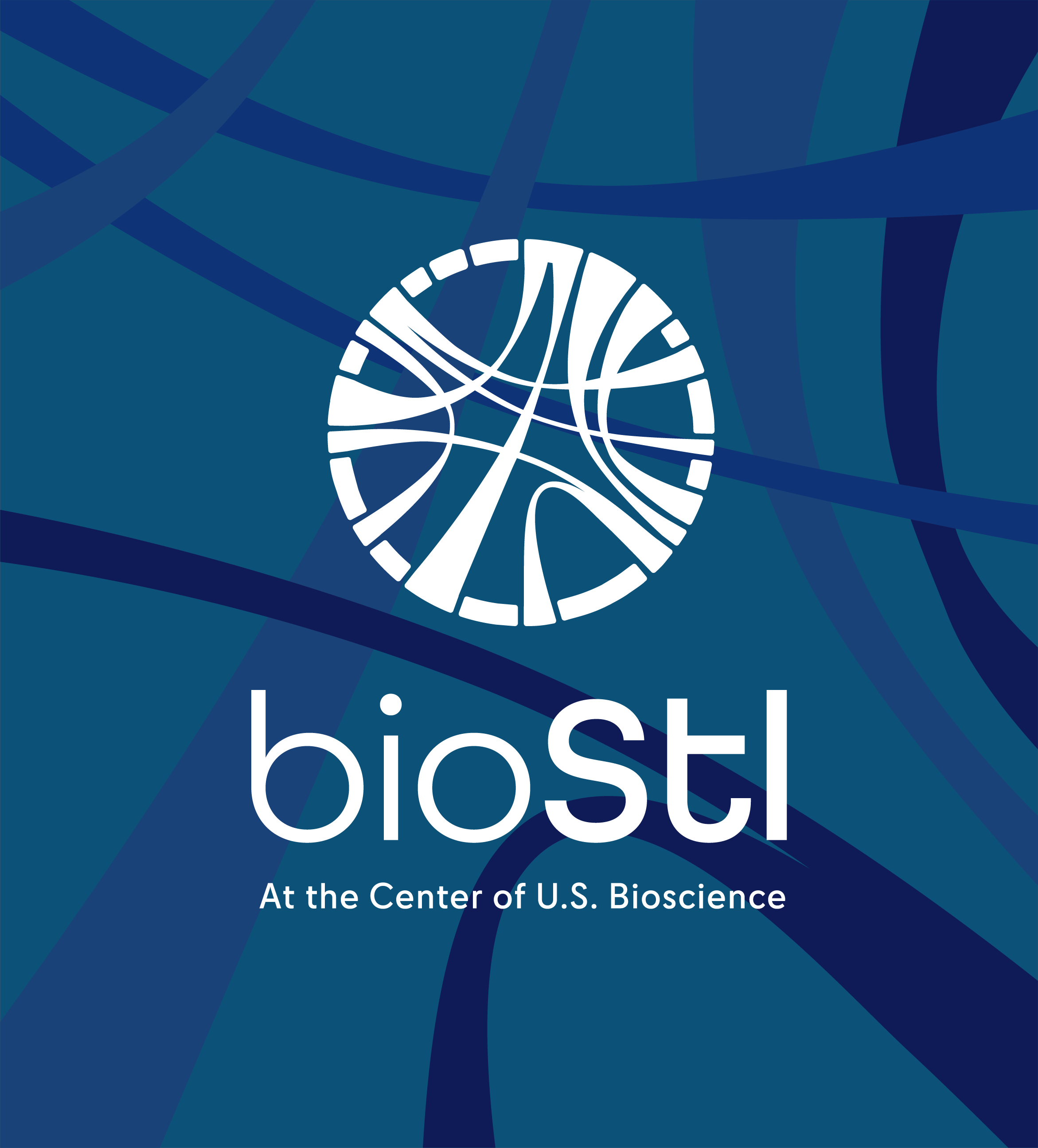
BioSTL
Product Design, Digital Design, Brand Design, Motion Graphics, Social | 2025-2026
BioSTL plays a central role in the U.S. bioscience ecosystem, supporting economic growth through innovation, workforce development, and ecosystem building. As part of a broader brand refresh, the organization set out to clarify its story, elevate its profile, and position itself for long-term relevance and growth.
I led the end-to-end design of BioSTL’s website and developed motion, social, and newsletter systems that translated the refreshed brand into clear, scalable digital experiences. The work focused on helping funders, partners, and stakeholders quickly understand what BioSTL does, why it matters, and why it is the center of U.S. bioscience.
My Role
This project was part of a larger brand refresh.
I joined the project to lead the full design of the website from scratch and to extend the refreshed brand across motion, social, and newsletter surfaces. My responsibilities included: Research and synthesis, defining the sitemap and information architecture, wireframing and page-level UX, designing layouts, templates, and visual systems, establishing color, typography, and layout guidelines, designing interactive and motion behaviors, creating social and newsletter systems, preparing developer-ready documentation and handoff
I collaborated closely with strategists, brand leads, and developers to ensure the system was clear, scalable, and easy to maintain over time.
Duration
September 2025 – January 2026 (4 months)
Goal
Design a clear, scalable digital platform that helps funders and partners quickly understand what BioSTL does, why it matters, and how its programs connect, while supporting long-term growth across web, motion, social, and newsletter channels.
The primary audience for the website is funders, institutional partners, and ecosystem stakeholders.
Tools
Figma, Adobe Creative Suite, Google Analytics, Google Suite
Team
Rich Nelson (Creative Director), Anna Yu (Design + Motion + Web), Allison Shaw (Communications)
The Challenge
Despite more than 25 years of measurable impact, BioSTL’s story was difficult to grasp quickly.
Users struggled to:
Understand the full scope of BioSTL’s work
See how initiatives related to one another
Identify clear entry points for engagement
Understand why BioSTL’s approach was unique
The challenge was not a lack of substance, but a lack of structure, hierarchy, and narrative clarity.
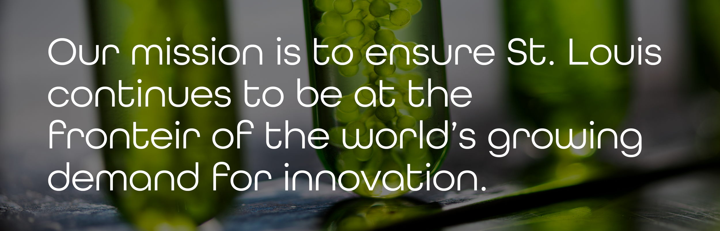
Strategic Framing: “Real Progress”
The brand refresh introduced a central idea: Real Progress.
From a product perspective, the challenge was translating this high-level positioning into a repeatable digital system that could work across the website, motion, social, and newsletters.
“Real Progress” was grounded in three truths:
Proven impact over 25 years in a fragmented ecosystem
Bioscience as an economic engine for regional and national growth
Forward momentum, acknowledging unfinished work and inviting participation
These principles guided information hierarchy, page structure, and interaction decisions.
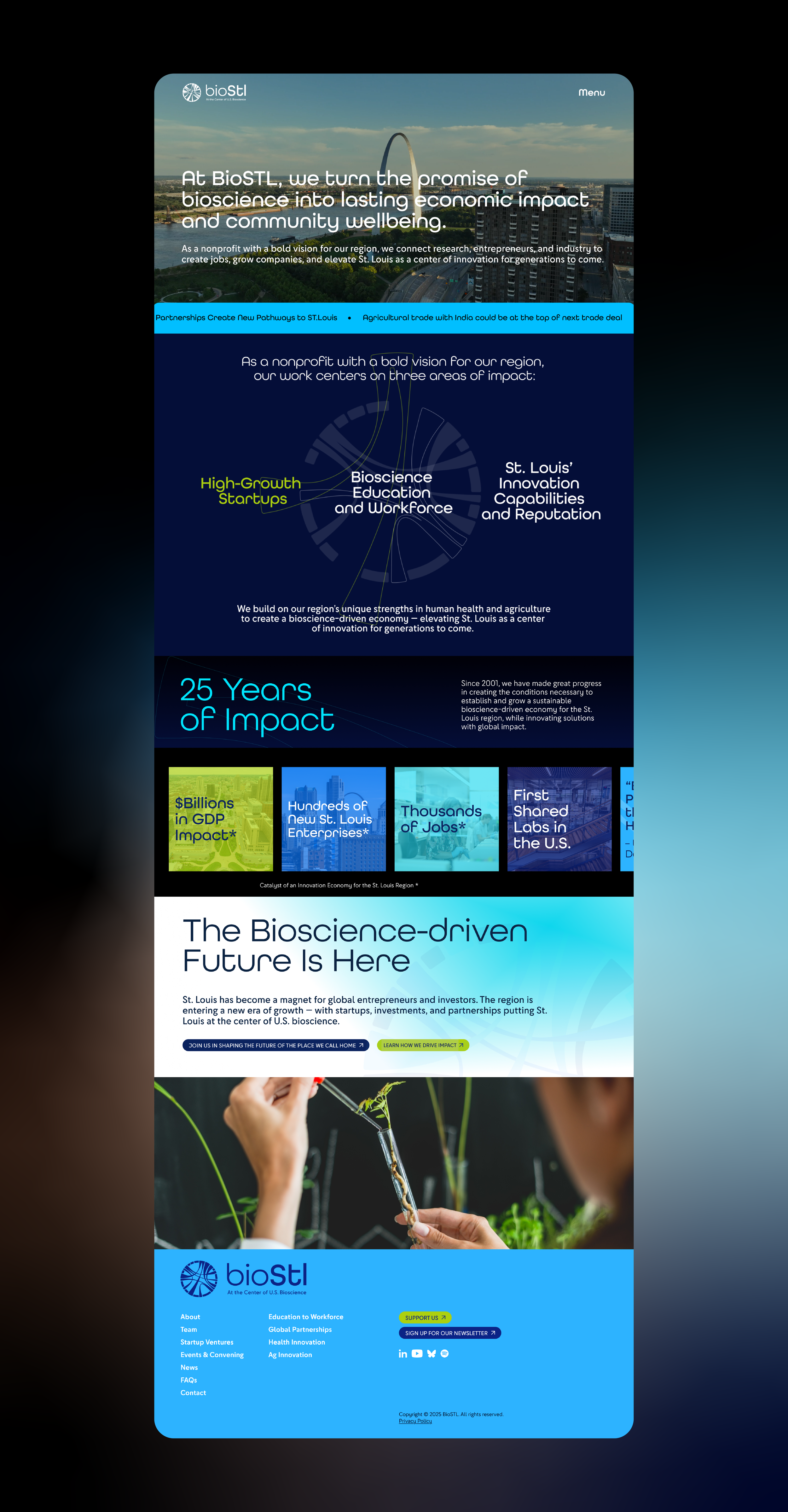
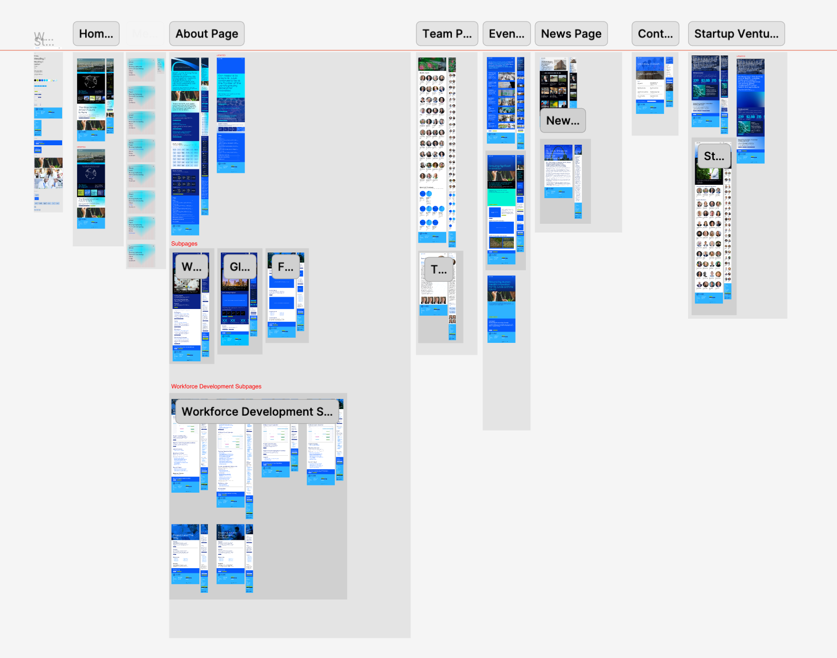
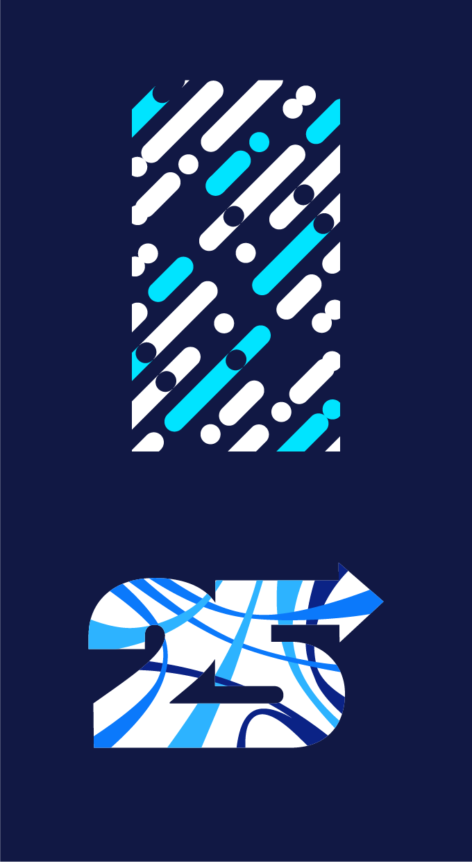
Visual System & Design
Modular page templates built for scalability
A restrained color system that supports hierarchy and readability
Typography optimized for long-form, informational content
Flexible, responsive layout patterns that adapt seamlessly across desktop, tablet, and mobile screens
The system was designed to be fully responsive and accessible across devices, ensuring a consistent, clear experience for users on phones, tablets, and larger screens. It feels confident and established while remaining adaptable for future growth.
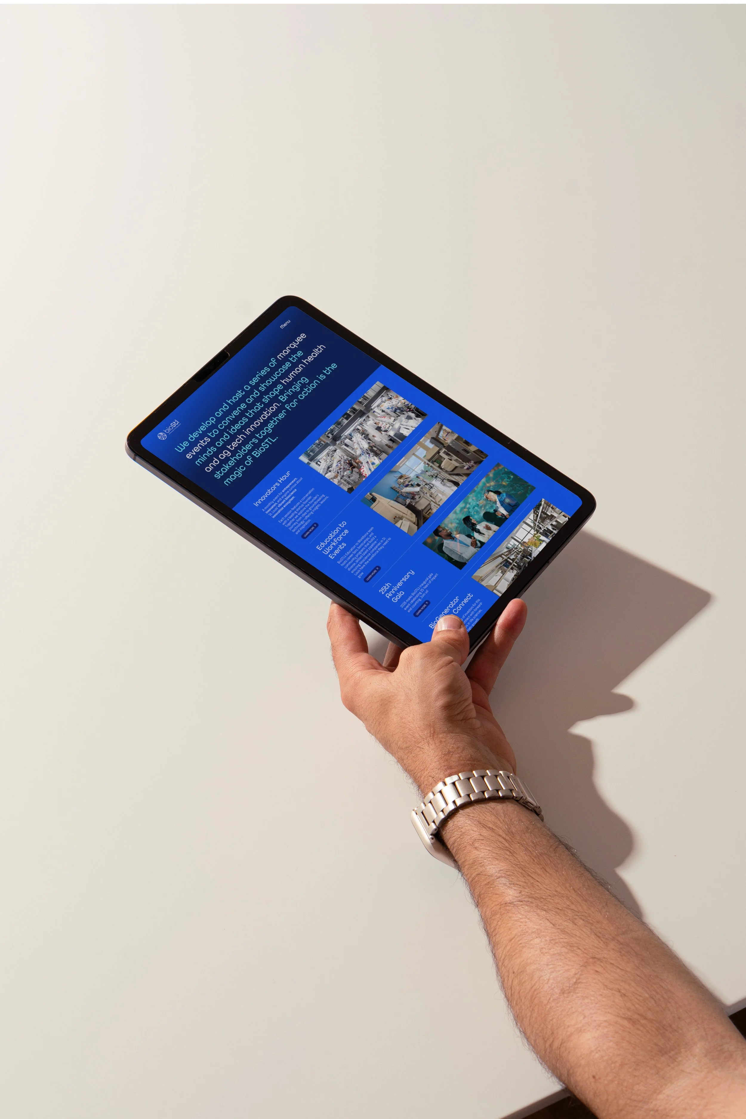
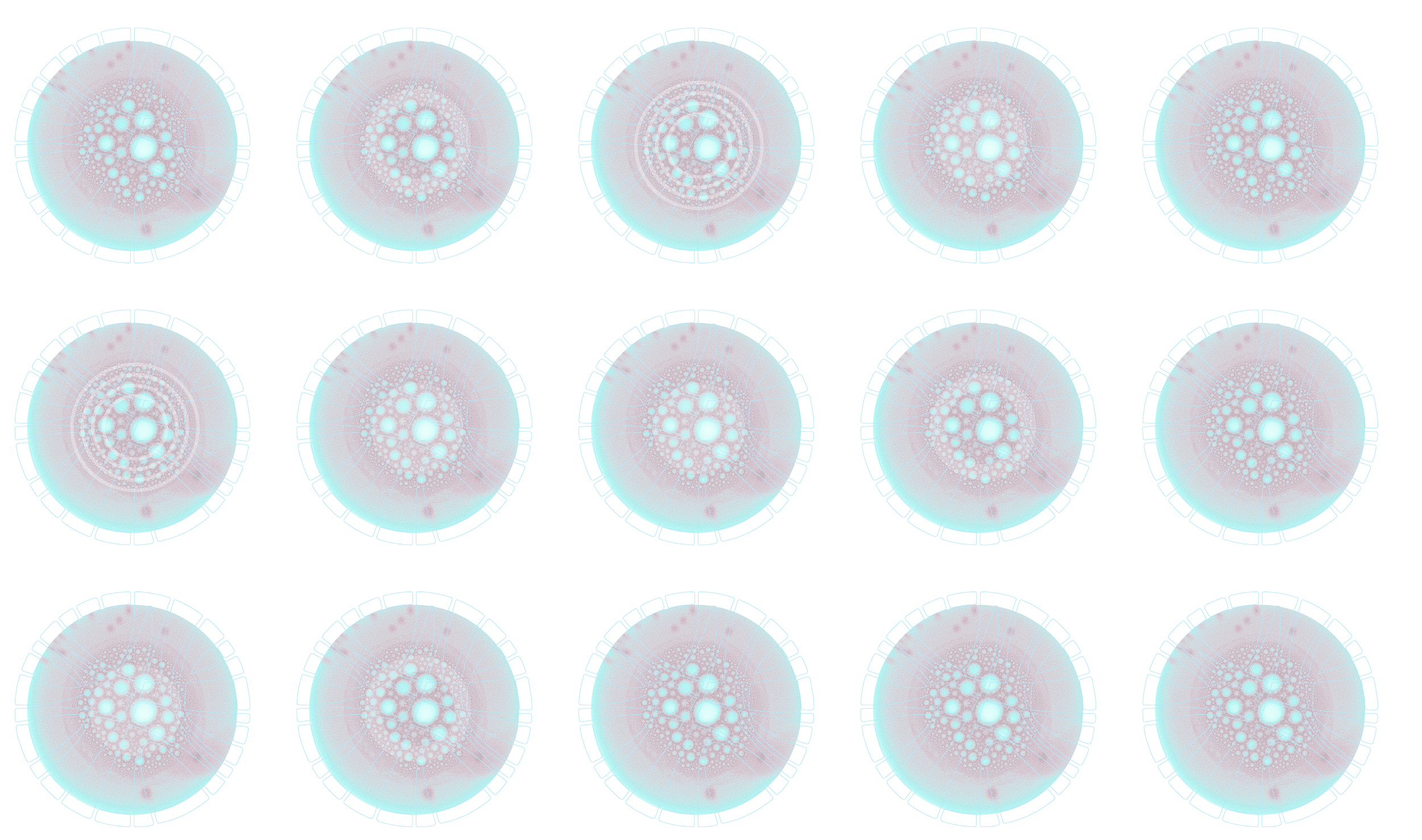
Motion & Interaction Design
Motion was used intentionally as a UX tool, not decoration.
It supports the experience by:
Guiding attention through dense content
Signaling transitions between ideas
Reinforcing hierarchy and flow
Reducing cognitive load
These principles were applied consistently across the website and extended into social and newsletter content.
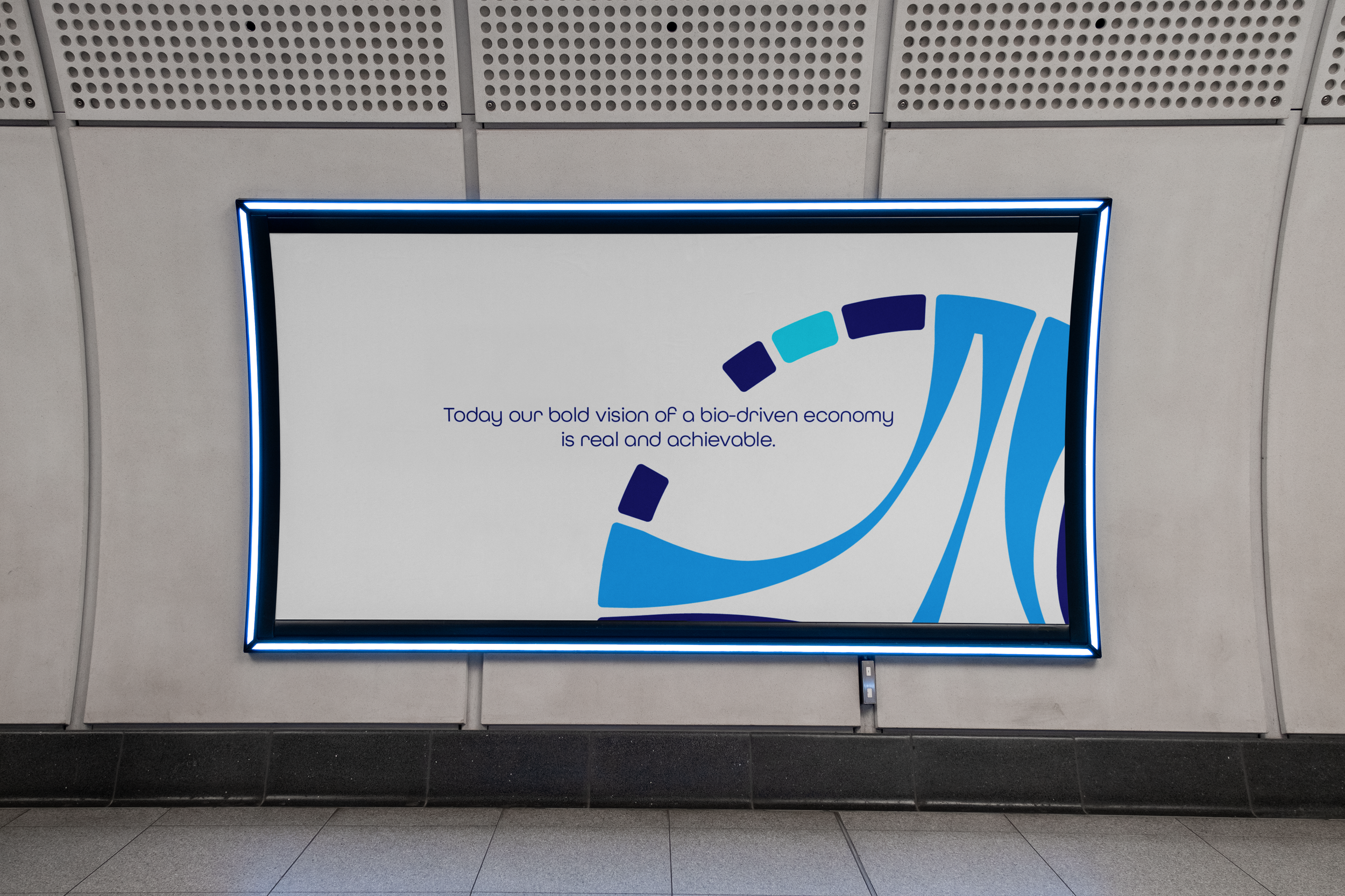
The brand video was also displayed in the St. Louis airport terminals, serving as a warm and engaging welcome for arriving visitors.
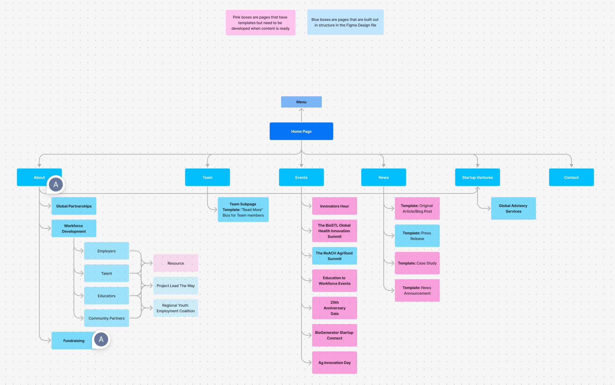
Information Architecture & Sitemap
I designed the sitemap to prioritize user intent over internal organization, creating clear pathways for understanding programs, events, and impact. The structure distinguishes between fully built pages and scalable templates, allowing the organization to grow content without redesigning the system each time.
This approach ensured the site could support future initiatives while remaining coherent and easy to navigate.
Build & Developer Handoff
Component documentation in Figma
Layout, color, image, CTA, and typography guidelines
Interaction and motion specifications
Flexible patterns that support future content expansion
The result was a system that the team could confidently maintain and extend. We had weekly syncs and Q&A sessions to make sure everything is aligned.
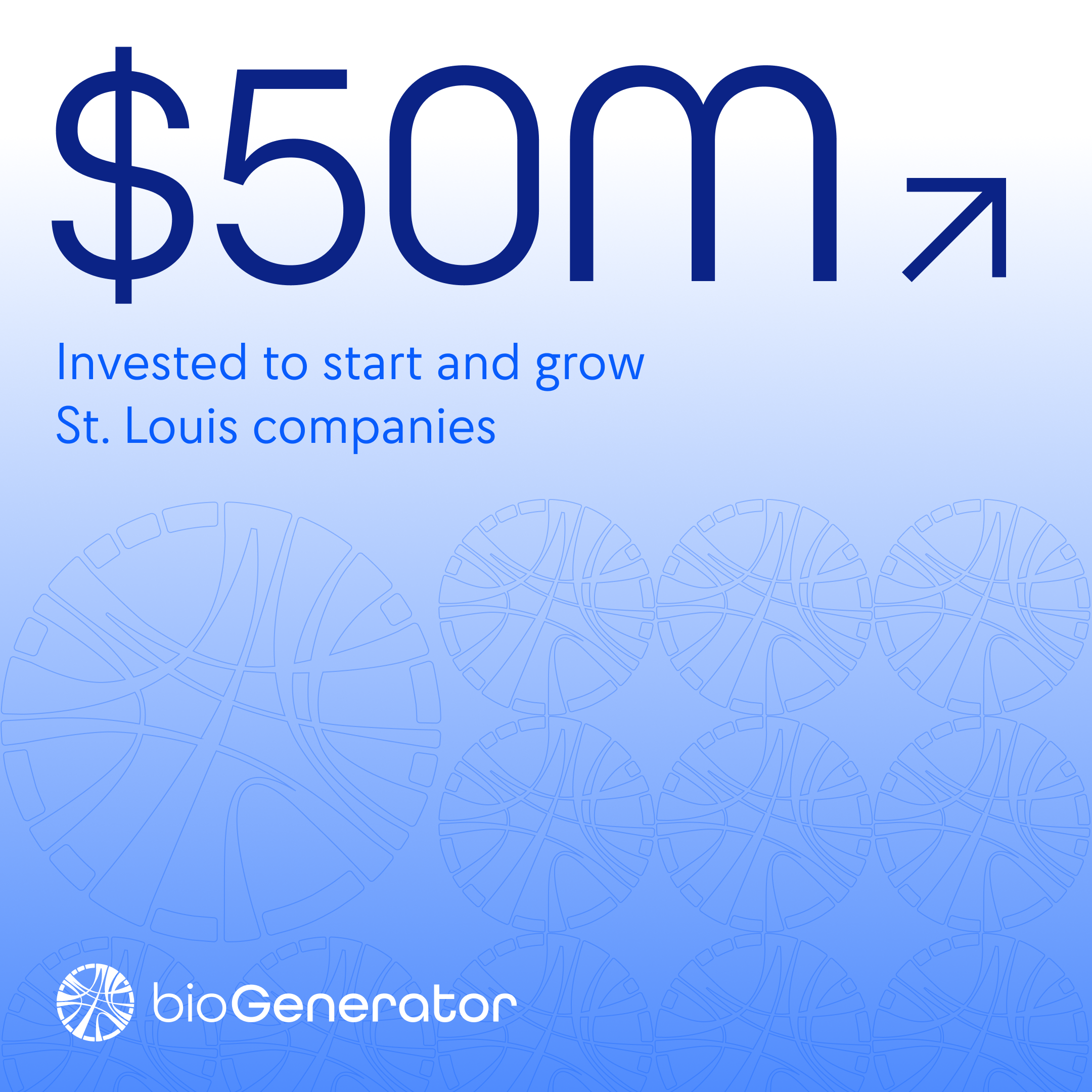
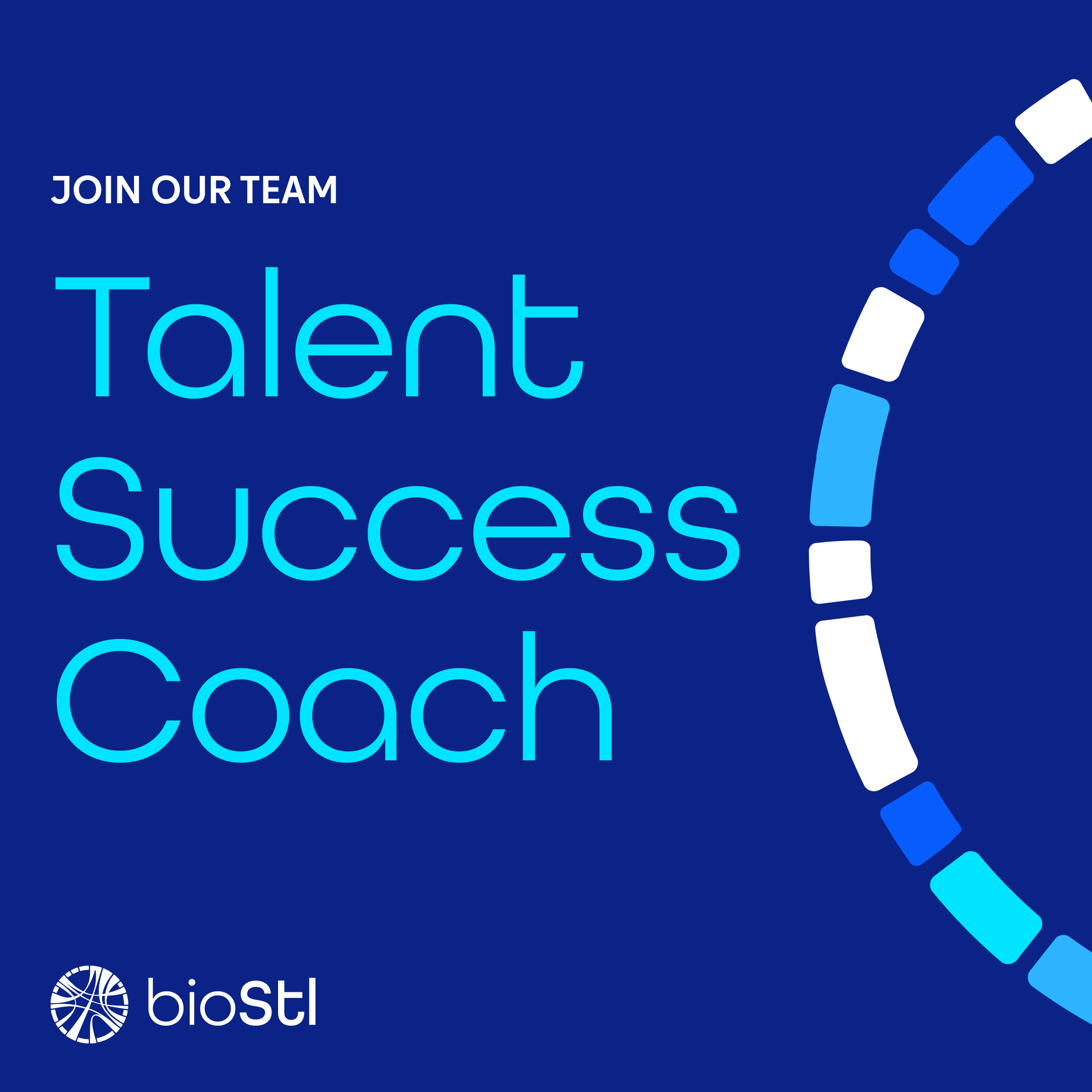
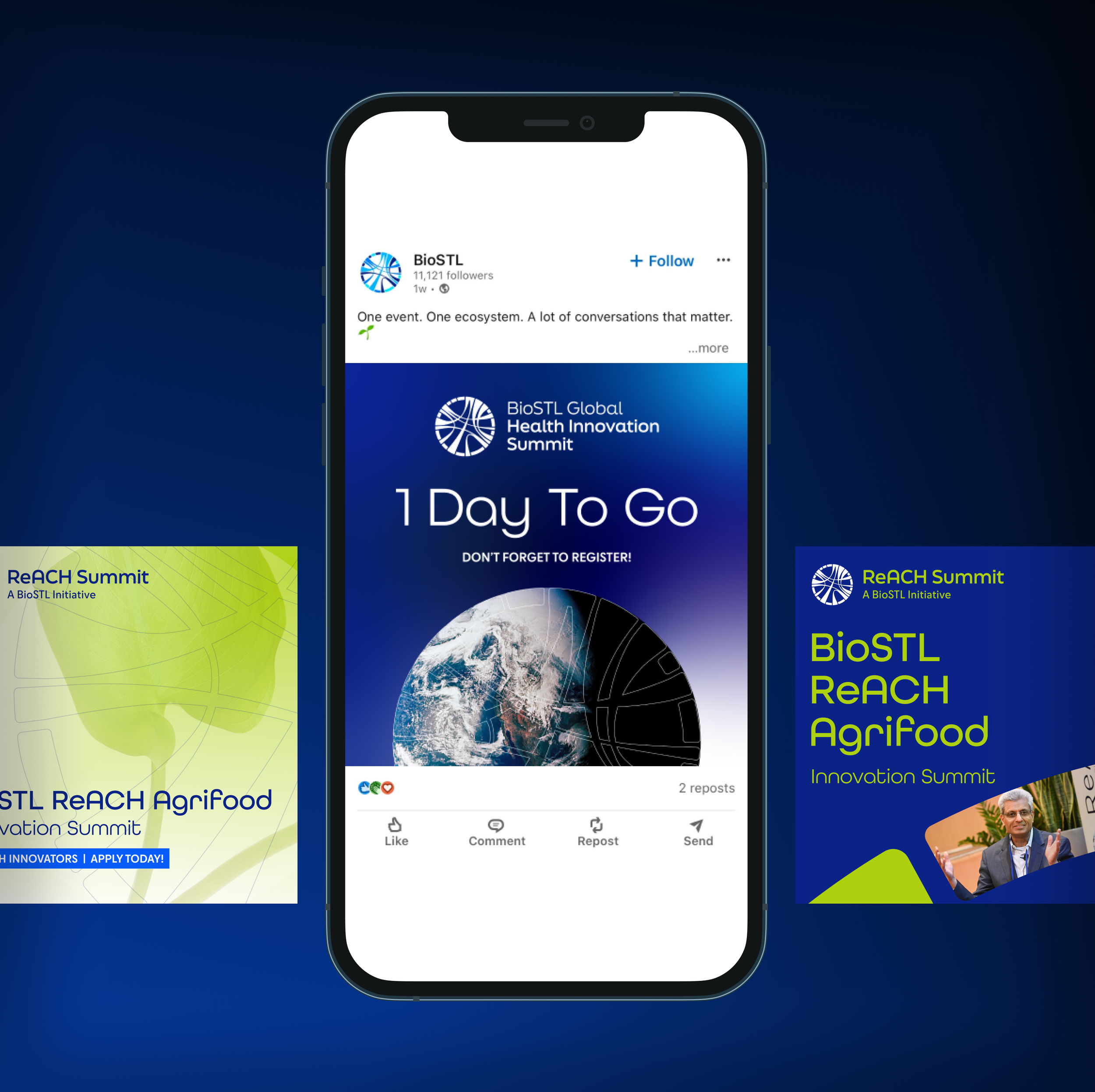
Social System
In parallel with the website, I designed social and newsletter systems to extend BioSTL’s story into faster, lower-attention environments.
The goal was to:
Maintain consistency with the website’s narrative
Adapt storytelling to platform-specific behaviors
Create reusable templates that balance clarity and expression
Together, these systems ensure BioSTL communicates with a unified voice across channels.
Outcome
A clear narrative experience for understanding BioSTL’s mission and impact
A decision-support tool for funders and partners
A scalable system that supports long-term growth
Internally, the work improved alignment and content organization. Externally, it created a more accessible and confident experience for users navigating a complex bioscience ecosystem.